Images are powerful and the standard world map is etched in our minds. But alternative versions of the map can make us look at the world differently. Let’s go on a journey:
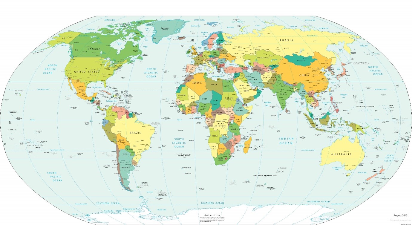
The image below shows a typical map – Europe is the centre of the world. You can tell who created this version.
If we scale countries by their proper size, we suddenly find that Africa and South America look much bigger (see below). The North, therefore, shrinks in importance.
But how about if we re-center the world map with Asia at the centre. We find that China and India become prominent while Europe falls to the wayside on the edge.
Hang on, but why is north on the top anyway? How does the world look ‘upside down’? The image below kinda messes with your head. Australia and South America become more prominent and Europe and North America fade.
Finally, we can zoom into regions in different ways. I came across this map of the Mediterranean tilted on its side. I find it quite mind-blowing. You can recognise Italy jutting out into the Mediterranean, but you need to think more carefully about the other countries. You have Greece just below Italy and Turkey sticking out from the bottom. Israel and Lebanon are on the bottom left, while Libya is on the left. Right on the top, you have Spain. It really makes you rethink the region.
We use cookies for a number of reasons, such as keeping the Macro Hive site reliable and secure, personalising content and ads, providing social media features and to analyse how our site is being used. By clicking "accept" or any content on the site, you agree that cookies can be placed ACCEPT or you may Manage Preferences
Privacy & Cookies Policy
Privacy Overview
This website uses cookies to improve your experience while you navigate through the website. Out of these cookies, the cookies that are categorized as necessary are stored on your browser as they are essential for the working of basic functionalities of the website. We also use third-party cookies that help us analyze and understand how you use this website. These cookies will be stored in your browser only with your consent. You also have the option to opt-out of these cookies. But opting out of some of these cookies may have an effect on your browsing experience.
Necessary cookies are absolutely essential for the website to function properly. This category only includes cookies that ensures basic functionalities and security features of the website. These cookies do not store any personal information.
Any cookies that may not be particularly necessary for the website to function and is used specifically to collect user personal data via analytics, ads, other embedded contents are termed as non-necessary cookies. It is mandatory to procure user consent prior to running these cookies on your website.