
This article is only available to Macro Hive subscribers. Sign-up to receive world-class macro analysis with a daily curated newsletter, podcast, original content from award-winning researchers, cross market strategy, equity insights, trade ideas, crypto flow frameworks, academic paper summaries, explanation and analysis of market-moving events, community investor chat room, and more.
We use three measures of mobility using data from Google, Apple, and TomTom. We track them across 50 countries. Here’s the high level summary:
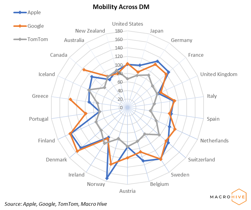
- In DM, mobility levels increased in most countries. Apple and Google (country data) agree on increases in Western and Southern Europe, as well as in the US where there were no major changes over the week. With the exception of the US, TomTom data (main cities) disagrees with those results, showing no change or even decreases in activity over the week. This makes sense as the holiday season decreases city traffic and increases countryside activity.
- In EM, Apple and Google agree on mobility increases in CEE and Brazil. In the “No Major Changes” section, there is overall agreement for Asian and Middle Eastern countries, as well as Argentina. TomTom is again more bearish, probably for the same reason as in DM.
- For more details, first two tables categorize each country in terms of increases, decreases, or no change. The radar chart shows the current snapshot of all providers relative to baseline. The heatmap tables that follow provide last week’s daily values in relation to each provider’s baseline. Finally, we provide charts with mobility time series based on Apple data for each country we follow. We define normal/baseline levels as 13 Jan 2020 for Apple data and a median value of week days for 3 Jan – 6 Feb 2020 for Google data. TomTom baseline is the same day of last year.
- We recently changed the way we look at Google data, with current values now based on the average of the Retail & Recreation, Workplaces, and Parks categories. The latter category replaced Transit. This change aligned the two data sets much better (Apple and Google), closing their gap and facilitating better comparisons on the radar chart.
Bilal Hafeez is the CEO and Editor of Macro Hive. He spent over twenty years doing research at big banks – JPMorgan, Deutsche Bank, and Nomura, where he had various “Global Head” roles and did FX, rates and cross-markets research.

(The commentary contained in the above article does not constitute an offer or a solicitation, or a recommendation to implement or liquidate an investment or to carry out any other transaction. It should not be used as a basis for any investment decision or other decision. Any investment decision should be based on appropriate professional advice specific to your needs.)