
This article is only available to Macro Hive subscribers. Sign-up to receive world-class macro analysis with a daily curated newsletter, podcast, original content from award-winning researchers, cross market strategy, equity insights, trade ideas, crypto flow frameworks, academic paper summaries, explanation and analysis of market-moving events, community investor chat room, and more.
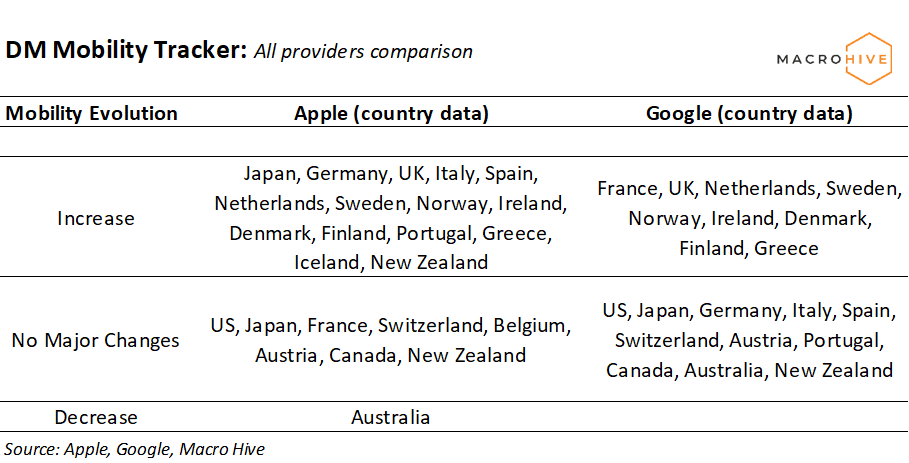
We use three measures of mobility using data from Google and Apple. We track them across 50 countries. Here’s the high level summary:
- In DM, there were no major changes in the US. Apple points to activity being back to baseline, while different measures of Google point to mobility levels between 75% and 95% of baseline. However, both baselines are recorded with winter activity as a benchmark and this needs to be accounted for when interpreting the numbers.
- Canada, Japan, New Zealand, Switzerland, and Austria are the other countries which haven’t seen any major increases over last week.
- In terms of increases, there is a consensus for UK, Ireland, Northern Europe, and Greece. The only decrease was Apple data for Australia.
- In EM, almost no country saw changes since last week. Both Apple and Google agree on this. Only Hong Kong saw a decrease.
- Asian countries are almost back to baseline, with the exception of Singapore, India and the Philippines. CEE is also close to baseline. Among the Latam countries we follow, Brazil has the highest mobility (roughly 70% of baseline), while Chile and Argentina the lowest (for both values range between 30% and 50% with no agreement between Apple and Google)
- For more details, here is the breakdown of the mobility tables we publish:
- a) First two tables categorize each country in terms of increases, decreases, or no change.
- b) The radar chart shows the current snapshot of all providers relative to baseline. This edition we have two of them, incorporating different variations of the Google data. First radar chart averages the following Google categories: Retail and Recreation, Transit, and Workplaces. The second one also adds the Parks category. The latter addition significantly reduces the gap between Apple and Google data.
- c) The heatmap tables that follow provide last week’s daily values in relation to each provider’s baseline. Same as in the radar chart, there is a second version adding the parks category for Google.
- d) Finally, we provide charts with mobility time series based on Apple data for each country we follow. We define normal/baseline levels as 13 Jan 2020 for Apple data and a median value of week days for 3 Jan – 6 Feb 2020 for Google data.
Bilal Hafeez is the CEO and Editor of Macro Hive. He spent over twenty years doing research at big banks – JPMorgan, Deutsche Bank, and Nomura, where he had various “Global Head” roles and did FX, rates and cross-markets research.

(The commentary contained in the above article does not constitute an offer or a solicitation, or a recommendation to implement or liquidate an investment or to carry out any other transaction. It should not be used as a basis for any investment decision or other decision. Any investment decision should be based on appropriate professional advice specific to your needs.)